

AI built my blog in a few hours. Then I spent the next day and a half testing it and making it actually work.
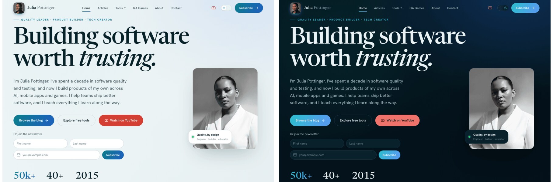
Here is what nobody tells you about building a site with AI: it gives you something that looks finished, and looking finished is not the same as being finished. The homepage rendered, the colours were nice, the buttons were there. Underneath, a lot of it was wrong or simply not wired up to anything.
I test software for a living, so I did to this site exactly what I do to any build I am handed. I did not trust it because it rendered. I went looking for what was broken. This is what I found.
It looked right on my laptop and broke on a phone
The design came over from Claude Design and looked good on my screen. On a phone it was a different story. Spacing was off, sections overflowed, and things sat in the wrong place. Responsive layout is exactly the kind of thing AI does not get right on its own, because it cannot see the result.
I asked the coding agents to go through the app on different devices and screen sizes and fix what broke. Honestly, they struggled. Codex did a better job of working through the responsive issues than Claude did, but it still missed plenty, and I ended up checking every screen size myself. That is the work: open it on a small screen and actually look.
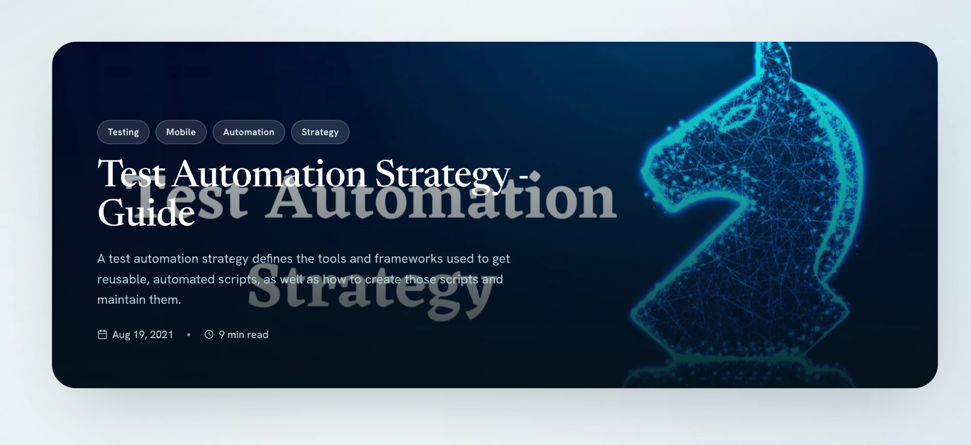
Most of the fixing was a back and forth like this, me describing what felt wrong, the agent reworking it. The worst offender was the “How I think about quality” section: the cards overlapped, the text of one ghosting through the next, and you could barely scroll it.

The quality section before the fix: the card text overlapping and ghosting through, nothing sitting where it should. Here is the conversation that turned it into a real carousel:
Light mode was fine. Dark mode hid half the page.
The site has a light theme and a dark theme. The AI styled everything for light and called it done. The moment I switched to dark, text disappeared into backgrounds and some elements lost all their contrast.
So I went back and forth on colours, element by element, making sure everything stays visible and readable in both themes. This is not a detail you can skip. Plenty of your readers use dark mode, and an invisible heading is a broken heading.
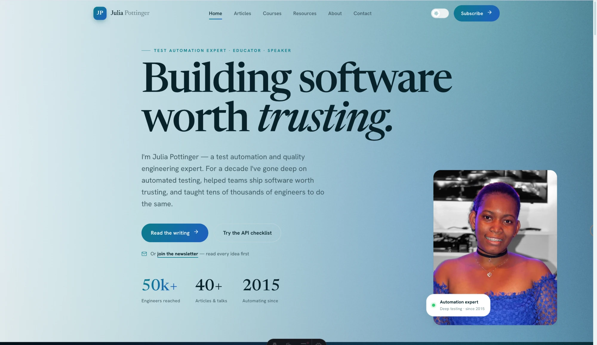
Light mode and dark mode, side by side, after I went through and fixed the contrast.
And it was not only dark mode. Some titles sat on top of a busy image with a faded ghost heading behind them, readable to no one in any theme.
A real one: the article title fighting a faded heading and a busy image behind it. Contrast is not only a dark-mode problem.
Centred is not a given
A lot of things were not actually centred, vertically or horizontally, even when they looked close enough at a glance. The hero did not sit right on wide screens. I went through and lined things up properly. My commit history is honest about it, with messages like “Center the hero composition on wide screens.” None of that is glamorous, and all of it is the difference between a site that feels finished and one that feels slightly off in a way readers notice without knowing why.
The real hero on a wide screen before I lined it up. The composition drifts and leaves dead space at the edge, the kind of off-balance you feel before you can name it.
A pretty form with no logic behind it
The design gave me a newsletter box. That is all it was, a box. It had an email field and nothing else. No first name, no last name, and it was not connected to anything that would actually capture a subscriber.
So I added the fields a real signup needs and wired the form to my email platform so people who subscribe actually land somewhere. This was a pattern across the whole build. The AI gave me the shape of a feature and I had to put the logic in behind it. A form that looks like a form is not a form until it does something.
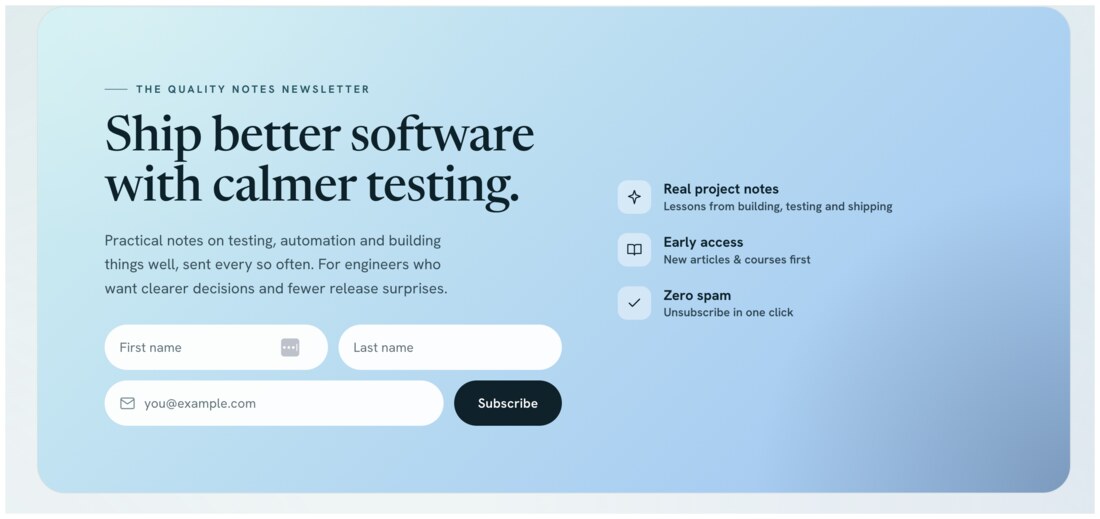
The finished signup. The AI handed me a bare email box; this is after I added the fields a real signup needs and wired it up so subscribers actually land somewhere.
And wiring it was its own lesson. The form looked connected, but when I sent myself a test, no email came. Two things were silently broken underneath.
A form that submits is not a form that works. You only find that out by sending the test and waiting for the email that does not come.
AI is strong at generating the surface of a feature. It is weak at the wiring underneath. Assume nothing works until you have tested that it does.
The data that makes a blog mine
My old blog was not just pages. Each post had a clap count, a record of how many people had read it, and categories that organise everything. The new build did not connect to any of that. It was a fresh template with none of my history flowing into it.
So I reconnected the pieces that make it my blog and not a demo: the claps on each post, the read data, and the categorisation of the articles. None of that shows up when you glance at the homepage, which is exactly why it is easy to miss and important to check.
The claps were the sneakiest. A number sat under every post, so they looked fine. But the AI had quietly turned them into a heart that only counted in each visitor’s own browser, which means every reader started at zero and saw only their own taps. Years of real totals were not connected at all.
One post had over eight hundred claps waiting in the old data. None of it would have come back if I had trusted the number on the screen. Comments were the same kind of trap: the old threads only reappear if the new site files them under the exact identifier they had before.
Images that came in the wrong size
Some images looked fine where they came from and rendered wrong once the site was built: stretched, squashed, or blown up to the wrong size entirely. My commit history has the honest trail, with messages like “Fix distorted content images.” The AI produced markup that was structurally fine and visually wrong, and had no idea, because it cannot look at the rendered page the way a person can.
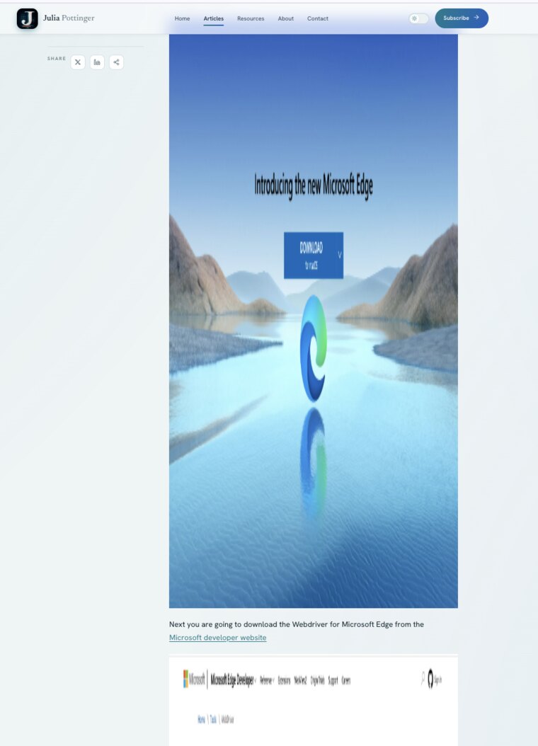
One real example: a featured image came in oversized and dwarfed the whole article, the body text pushed way down the page. It read as correct in the markup and wrong on the screen.
The things that were just missing
This was the quiet one. A lot of what lived on my old blog simply was not on the new one, and nothing flagged it. AI builds what you point it at. It does not know what your old site had that mattered to you. Finding the gaps meant sitting down and comparing the two, feature by feature, and asking for each missing piece back. That comparison is a human job. Nothing in the tooling does it for you.
It was not only features. Years of posts came across with blank gradient placeholders where their real featured images should be. The images were never migrated, and nothing errored to tell me.
Old posts that came over with generic gradients instead of their real featured images. Nothing broke; the images simply were not brought over.
Concrete examples: the scroll-to-top button from my old blog was gone. So were the links to the things I am proudest of. My game, Tropic Tumble, and my studio, JPott Studios, were nowhere on the new site until I noticed and asked.
Whole sections came in with the spacing broken
The layout did not just wobble on phones. On a normal screen, the AI left big empty voids where sections should breathe, and in one place dropped an old photo back in where the new one belonged.
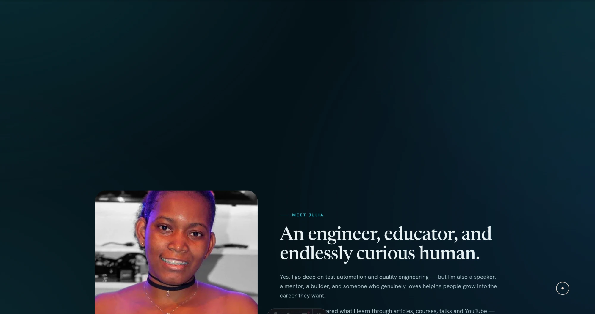
The Meet Julia section: a huge empty band above the content, and the old portrait still sitting there instead of the new one.
It was a pattern, not a one-off. The articles page had a wide gap under the search bar, the topics block on the home page floated in too much space, and one band was almost entirely empty. None of it throws an error. You only see it by scrolling the whole page and asking, at each section, whether the gap looks deliberate.
The bugs you only catch by using it
Some problems never show in a screenshot. They show when you actually move around the site, which is the whole argument for testing by hand. The stat numbers under the hero sat frozen at zero until you scrolled to them, then counted up too fast to read. The “beliefs” carousel drifted on its own before I had even touched it. And the hero photo blinked on a cold load instead of settling in cleanly.
Then there was the long tail, the small things I only found by opening every page and actually looking:
- The scroll-to-top button from my old blog was gone.
- Old comment threads would not load until each page used the exact identifier they were filed under.
- A release date showed a day early, a timezone off-by-one.
- The Tools menu in the nav was oversized and swallowed the rest of the navigation.
- The coming-soon tool card broke on mobile.
- Image captions sat squashed under their images instead of using the full width.
- A highlight box was shorter than its row and the wrong colour.
Each one is small. Together they are the gap between a site that looks done and one that is.
What to test on an AI-built site
If you take one thing from this, let it be a checklist. When AI hands you a site that looks done, test these before you believe it:
- Responsive. Open every page on a real phone width. Layout is where AI is weakest.
- Theming. Check light and dark. Look for text that vanishes and elements that lose contrast.
- Alignment. Confirm things are actually centred, not almost centred.
- Functionality. Every form, button, and link. The shape of a feature is not the feature.
- Integrations. Newsletter, comments, anything third-party. Did it actually connect?
- Data. Counts, history, categories. The parts a glance does not show.
- Images. Are they all loading, and at the right size, on the live build?
- Parity. Compare against the old site, item by item. Find what is silently missing.
Build it so there is less to catch
Testing finds these. Building differently means fewer of them reach you at all:
- Put the constraints in the first prompt. Say it up front: must work at phone width, light and dark, real images, wire the forms, keep the old URLs and data. Most of my bugs were things I never asked it to get right, so it did not.
- Compare against the old version, item by item. AI builds what you point it at. It does not know what mattered to you that is now missing.
- Add a few cheap guards. A schema that fails the build on a broken post, a visual test that screenshots the key pages. They catch the boring mistakes so your attention goes to the ones that need a human.
The pattern underneath all of it: AI gives you the surface fast, and the surface looks finished. Your job is to check the real behaviour, not the screen.
The honest trade-off
There is a real cost to building this way, and I am not going to pretend there is not.
I can now say I rebuilt my site. But I did not write most of the code. If someone sat me down and asked how a particular part is implemented, line by line, I could not walk them through it the way I could with the old one, because I did not type it.
The old blog was the opposite. I built every piece by hand, which meant I learned it deeply enough to teach it. I worked through React state and effects, Gatsby’s data layer, a Formik and Yup contact form, a custom subscription form. Then I turned around and wrote tutorials on exactly those things: Formik and Yup field validations, scroll to top in React and Gatsby, a transparent-to-solid header on scroll, and adding tags to a Gatsby blog. You do not write those unless you went through what broke and why. The fast rebuild did not hand me that understanding, because I did not do the hand-to-hand part that produces it.
| Building it by hand | Building it with AI |
|---|---|
| Slow. Weeks, then months of upkeep. | Fast. A couple of days. |
| You learn the stack deeply enough to teach it. | You can ship without learning it deeply. |
| You can answer hard questions about your own work. | You cannot, unless you read what was built. |
| High barrier. Many people never start. | Low barrier. The stalled project finally ships. |
Neither column is wrong for everyone. But look at the trap in the second one. It is entirely possible to ship something you do not understand at all, and that is the part to take seriously.
Use AI well, but stay in control
The trap is letting the AI generate whatever it wants, accepting it because it runs, and never looking underneath. Everything in this article is the opposite of that. I did not save time by skipping the thinking. I moved it to the front and put the testing at the end, where it belongs. I defined what the site had to do, made the design and flow decisions myself, used what I know about how sites are built to ask for a real structure, and checked every part of the result.
You no longer need to hand-write every line. You do need enough understanding to define the product, judge the design, direct the structure, and verify the result, and enough to read the code when something has to change. Hand the AI the building. Keep the judgment and the final call for yourself. That split, where AI does the work and a human holds the line, is the whole argument of the QA control layer for AI-assisted development.
I am not worried about the knowledge I skipped this time, because I earned it once, the hard way, on the old blog. That is exactly what let me direct this one and catch everything that was wrong. The lesson is not that you never need to learn how things work. It is that you learn enough to stay in control, then let the tool take the typing.
The build took a few hours. Making it actually work took the rest of those two days. If you build with AI, run it through that checklist before you put your name on it, and you get the speed without quietly shipping the mistakes.

Written by
Julia Pottinger
Hi, I'm Julia. I've been in QA for over a decade. I spend my days testing software and my own time building apps and games, and I write here to share what I learn, the practical, honest lessons you can actually use.


Comments 0
Share your thoughts, ask questions, or add to the conversation.