
I stopped writing on this blog for a while. Not because I ran out of things to say, but because I was burnt out. I had been pushing hard for a long time, and writing was one of the things I let go so I could catch my breath. The blog still worked. I just stepped back from it.
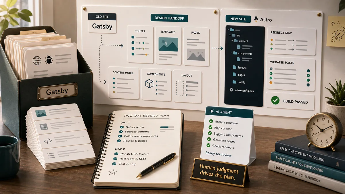
In 2025 I decided I wanted to write again. And the moment I opened the old site, my first thought was not “what should I write,” it was “I really need to update this thing.” It was built on Gatsby back in 2020, and it had aged. Before I wrote a single new post, I went looking at what I would rebuild it with.
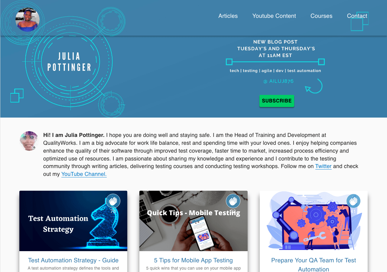 Before: the blog I built on Gatsby in 2020.
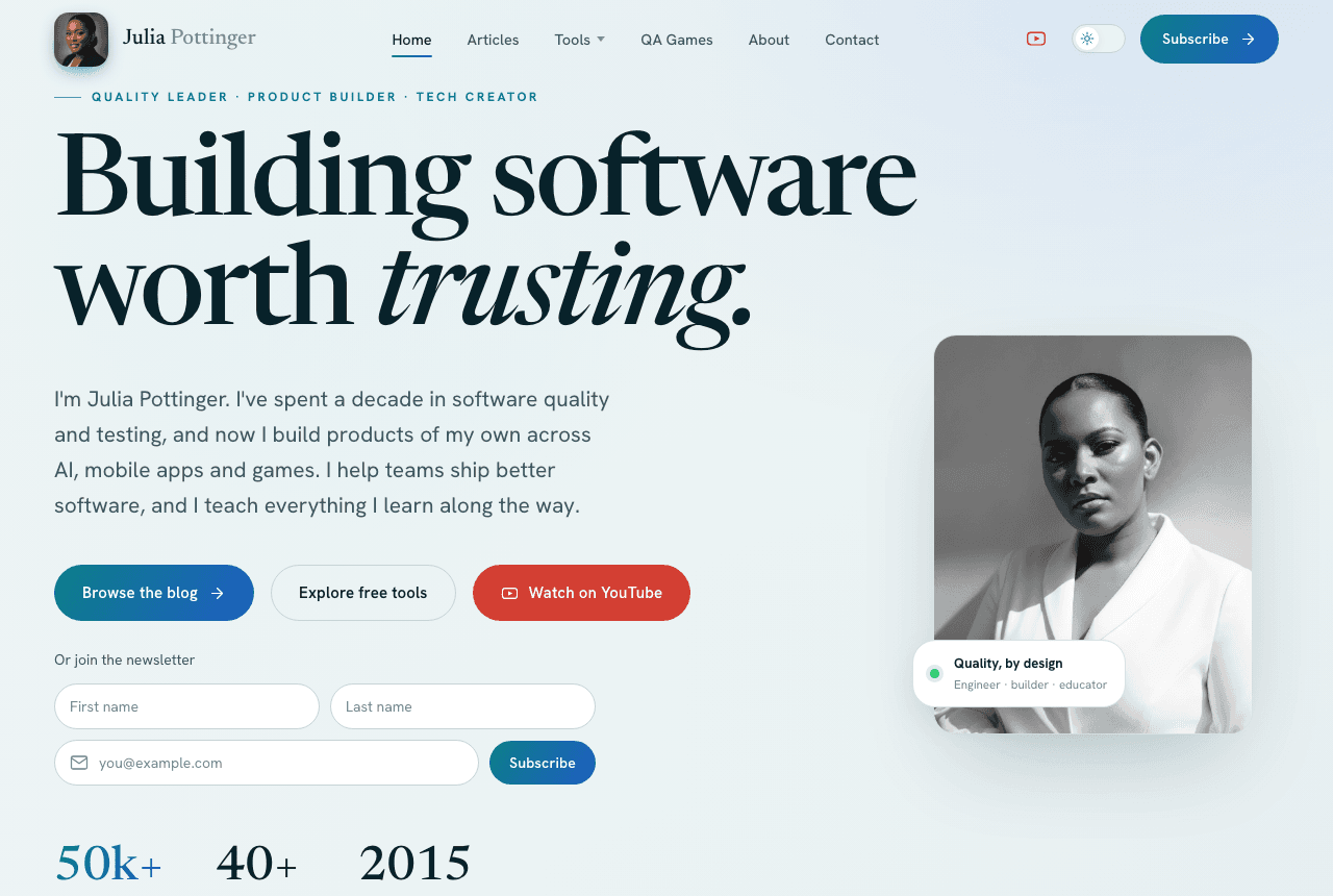 After: the same site, rebuilt.
What I looked at first
I did what most of us would do. I researched. Astro kept coming up as the modern choice for a content site, and I liked what I saw. But moving to it meant real work: setting up the project, migrating years of posts, and rebuilding every feature I had hand-coded the first time around.
Then there were the one-shot AI site builders, tools like Lovable. I looked at that path too. The problem was what it handed back. One big generated thing that looked fine on the surface but was not a real, structured project. It was closer to a single long file than to something I could maintain, extend, and actually own. For a quick landing page, that is fine. For a blog I want to keep for years and keep adding to, it was not.
What finally made it fast was a different approach: design the site properly first, then have AI build that design into a real project. I used Claude Design to shape it, then Claude Code and Codex to build it into an Astro project. Two days, from first commit to live. Here is how I did it.
Step 1: Design before code
I did not start in code, and I did not start in Figma. I started in Claude Design, described the site I wanted in plain words, and shaped it from there. This is where I spent most of my actual time, on purpose. Getting the design right before any code exists is what made the build fast, and it is the part I would never hand off.
What “design first” really means
Design first is not about colours. It is about deciding what the site is for before anything gets built. Before I described a single screen, I worked out what the site needed to do, what pages it needed, and how a reader should move from landing on the homepage to actually reading something or subscribing.
That is product definition, and it is human work. I knew the homepage had to say what I do now in one line, point people at the QA content, and make the next step obvious. Those calls came from me. Everything visual came after.
AI can draw the screen. It cannot decide what the screen is for.
The brief I actually gave it
I did not just say “make me a blog.” I wrote a real brief, the same way I would scope any product. Here is the heart of it, trimmed down:
Design a strikingly modern personal website and blog for Julia Pottinger. Redesign of my existing blog, so keep every current function, but elevate the experience.
Modern through motion, not colour: scroll-driven reveals, parallax, hover micro-interactions, the feeling that the site responds to you. Calm and confident, not flashy.
A restrained palette, teal and blue only, with neutral darks, soft whites, and space. Premium, never playful-bright. Carry the interest with imagery instead of colour.
Reading comfort always wins: clean long-form articles, strong typographic hierarchy, elegant code blocks, and a polished light and dark mode.
Keep every function (articles with search, full reading pages, claps, comments, about, contact, newsletter, the API testing checklist), then go beyond with at least one interactive learning element, and make every visitor feel guided.
Look at what that brief is doing. It is not picking fonts. It is telling the tool what the site is for, what it must not lose, and what good is supposed to feel like. That is the part only I could write.
How Claude Design actually works
Claude Design is not a static mockup tool. You describe what you want, and it builds a real, working design you can see and click through in the browser, with the conversation on one side and the live site on the other.
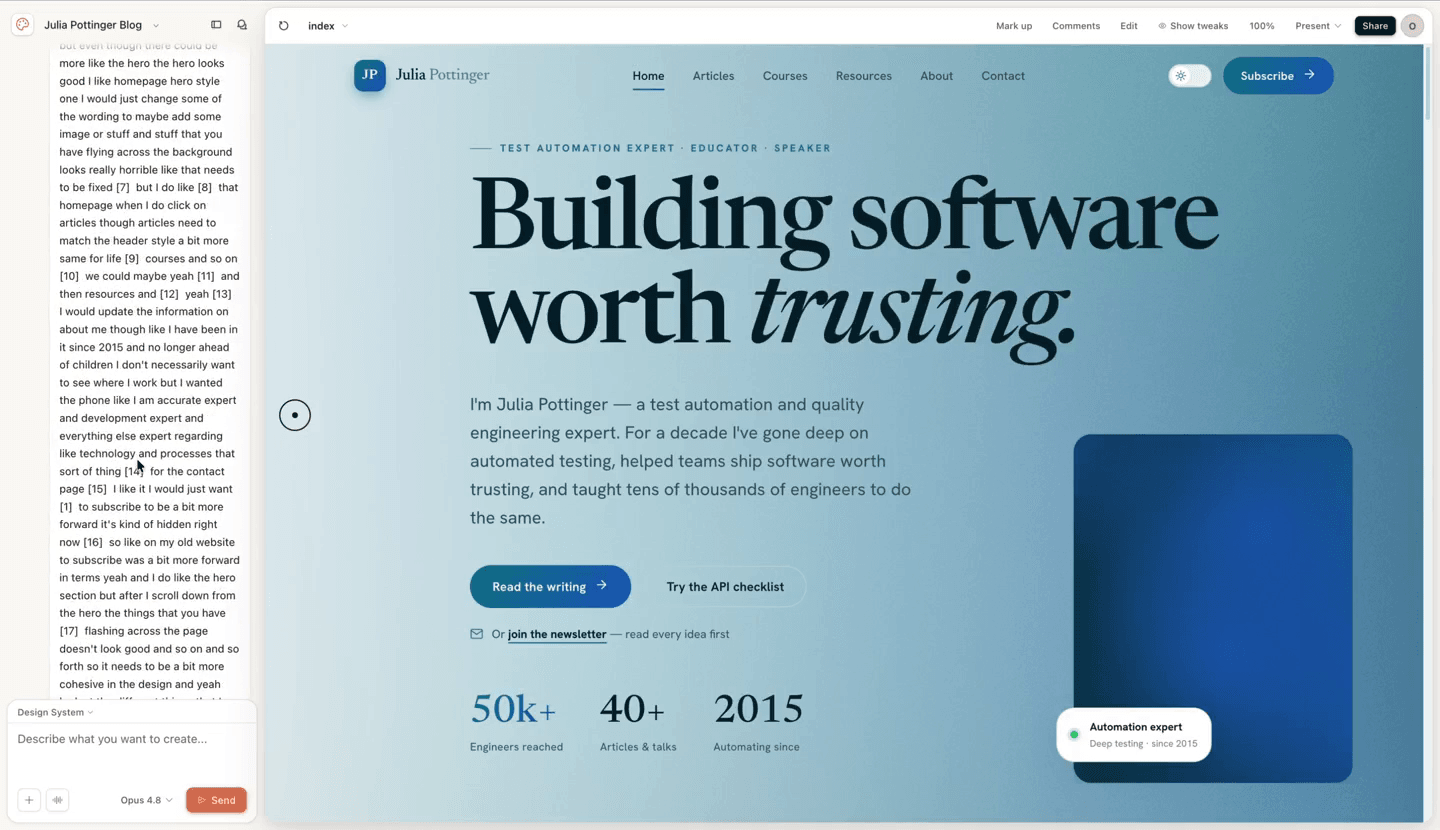 The homepage as a working, clickable design in Claude Design. The hero, the stats, and the layout were all real here first, before a line of the actual project was written.
It does not take one prompt and guess the rest. It asks the questions a designer would ask, then builds from your answers. Mine came down to a handful of direction choices:
- Motion. How much movement on the page. I asked for balanced: smooth reveals, nothing heavy or distracting.
- Typography. I let it propose the type, then reacted to what it showed me.
- Default mode. Light, dark, or match the reader’s system. I went with match the system.
- Imagery. Photos, illustration, or a mix. I went with a mix.
- The hero. The first thing anyone sees. I asked for a few options so I could look at them side by side and choose, instead of accepting the first one it drew.
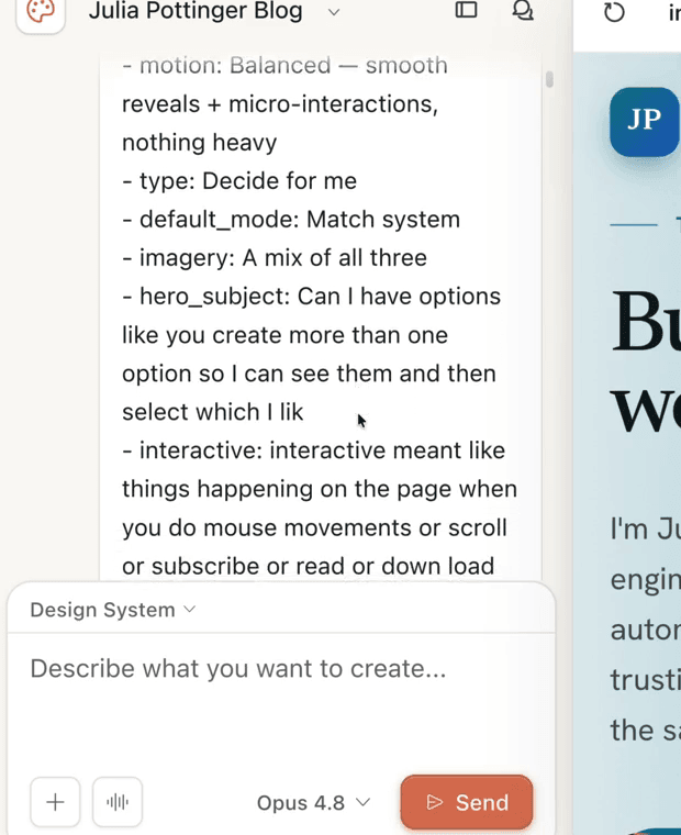
The design direction, set in plain language. Claude Design pins down motion, type, default mode, imagery, and the hero, and I answered each one in my own words.
You shape it by talking, not by nudging pixels
The real work was the back and forth. The first pass is never right, and that is fine, because you correct it the way you would talk to a person. When the page felt flat I said so, in plain words: it was too static, and nothing happened as I scrolled. When I wanted choices, I asked for a few hero options instead of one. Each time, it updated the live preview.
That is what beats a flat mockup. You are not imagining how the site will feel. You are clicking the real thing and catching the flow problems while they are still cheap to fix, before any of the project exists.
Then you hand the design to the build
When the design felt right, it became the spec. I handed it to the coding agents, Codex and Claude Code, and they built it into a real Astro project. Because the look and the structure were already decided, the build had far less of the “that is not what I meant” looping that eats your time when you start typing code with no plan.
The order matters more than the speed. Defining the product and judging the design are the human ends of this pipeline, and they are what let the AI move fast in the middle without going off the rails.
Step 2: Build it as a real project, not one big file
This was where the one-shot tools fell down, so it was the bit I cared about most. Because I have built sites before, I could ask for exactly the structure I wanted: clear routes, reusable components, and content kept separate from layout.
The structure I asked for
Every part has one job, and nothing bleeds into anything else.
src/
  pages/         # routes: index.astro, [slug].astro, articles/
  layouts/       # the shared page shell
  components/    # Header, Footer, PostCard, reused everywhere
  content/blog/  # every post is its own folder with an index.md
  styles/
The win here is boring on purpose. Each post is just a markdown file, the layout lives in one place, and adding a feature later does not mean untangling generated spaghetti.
- pages, the routes
- layouts, the shared shell
- components, reused everywhere
- content, one markdown file per post
- styles, kept out of the layout
Letting the agents build it from the design
The design from Step 1 was the spec. I did not describe components or write CSS. I pointed the agent at the finished design, set the hard guardrails, and then steered in plain language whenever something came back wrong. It went like this:
They stood up the whole project from that handoff: the routes, the shared layout, the components, the content setup. The very first commit in the repository is that prompt turning into code:
first commit — Modern redesign of juliapottinger.com, Astro implementation of the design handoff
Because I had already decided the structure, my job was to read and direct what they built, not to hand-type every file. When something came back wrong, I said so and they fixed it. That is the line between using AI and surrendering to it: I still owned the shape of the thing.
QA built into the build
Astro also lets you define what a blog post must contain, so a broken post fails the build instead of going live looking wrong.
// src/content.config.ts
const blog = defineCollection({
  loader: glob({ pattern: '*/index.md', base: './src/content/blog' }),
  schema: z.object({
    title: z.string(),
    description: z.string().optional().default(''),
    date: z.coerce.date().optional(),
    tags: z.array(z.string().nullable()).optional().default([]),
    draft: z.boolean().optional().default(false),
  }),
})
That schema is a small piece of QA built into the project. Forget a title and the site tells you at build time, not after you publish.
The schema is just the first layer. I also wrote a small suite of tests that run with npm test, each one guarding something I did not want to break by accident:
- One checks that my old posts keep their original publish dates, so a migration can never quietly re-date years of writing.
- One makes sure no two article hero images reuse the same treatment, so the art stays distinct.
- A few cover the newsletter signup: that it actually subscribes a reader and tags what they were interested in, and that it fails safely instead of silently dropping people when something is misconfigured.
- A visual test (Playwright) screenshots the key pages and flags any layout shift against a saved baseline. It has to switch the scroll animations off first, or the screenshots come back blank, which is the exact thing that bites you when you try to eyeball an animated site.
// package.json
"scripts": {
  "build": "astro build",
  "test": "node --test tests/*.test.mjs"
}
Then the deploy is its own gate. Every push to the repository triggers a fresh build on the host, so a post that breaks the schema, or a change that fails a test, never reaches the live site. It has to go green before anything ships.
None of this is heavy process. It is a handful of cheap checks that catch the boring mistakes for me, so the only things left to test by hand are the ones that actually need a human eye.
New pages stop being a fight
The payoff of doing it this way shows up the moment you add anything. New pages are not a fight, they are just another route reusing the same components. The resources hub, where the free QA tools live, is its own page that slotted into this structure without touching the rest of the site.
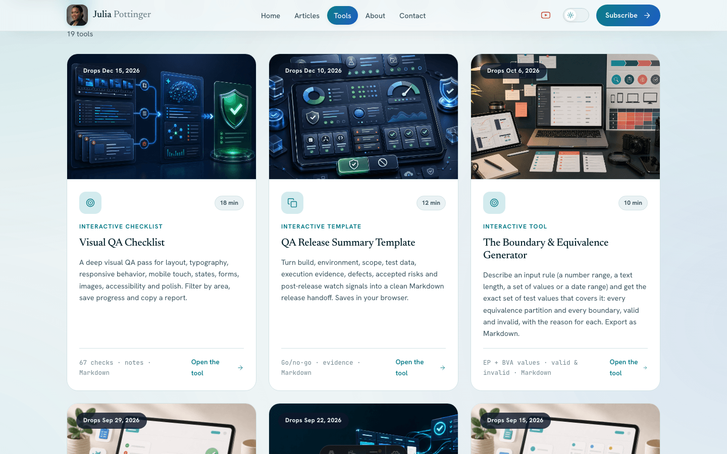 The resources hub. A separate page that the project structure made easy to add, without disturbing anything else.
Step 3: Real photos and hero art, without a shoot
My headshot was one I had been meaning to retake for years. I did not want a shoot day, and I did not want a stock photo standing in for me. I wanted a professional portrait that actually looked like me. That is harder to get from AI than it sounds.
I had tried this before
Honestly, I almost did not bother. I had already played with a few AI photo tools, and the headshots always came back feeling like someone else. Close, but not me. Something about the face was just a little off, and I could see it, and so could anyone who knows me. I kept trying, and I kept ending up with a picture I would never actually use.
A headshot that does not look like me is not my headshot, however polished it is.
What Fosho AI got right
Fosho AI was the first tool that gave me back myself. It turns your own selfies into professional photos, and the result actually looked like me, with the polish of a studio shot: even lighting, smooth skin, the portrait you would pay a photographer for. Not a polished stranger. Me, shot well.
I should say up front that Fosho was built by a good friend of mine, Dimitri Harding. He is one of a small group I work with, along with Orane Findley, on how to actually use AI in testing and in the things we build. We run coding sessions, build apps, and demo to each other every week to keep ourselves honest. So I trusted the builder before I trusted the tool. The portraits are what earned it a place on the site. It is on the Apple App Store now, with Android on the way, and I got to try it early on a prelaunch Android build.
It was also simple in a way I did not expect. I did not have to write a prompt. I browsed the styles, picked the kind of photo I wanted, and gave it a picture of myself. If I wanted to steer it, I could hand it a reference image or describe the look, and it filled in the rest: the lighting, the setting, the framing. Even a one-line request came back as a finished, styled portrait. And it was not a lucky one-off. I got a whole set of realistic photos I could actually use.
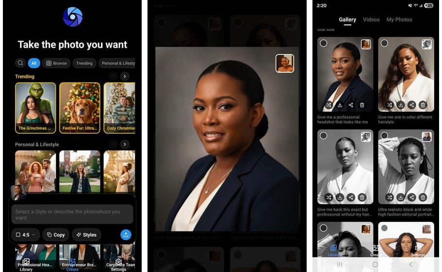
How I use Fosho AI. I pick a style, hand it my own selfies, and it gives me a whole set of finished, realistic portraits.
The real photo next to the AI one


Left, a real photo of me, taken on a camera. Right, made by Fosho AI from my selfies. No shoot, no photographer.
Look at them together. The one on the right is not a photo at all, and it does not read as fake. If anything it is the more polished of the two, the one that looks like I booked a studio for the afternoon. That was the bar I needed. Not a filter, not “close enough,” but a portrait I would put my name next to.
The rest of the artwork
For the abstract art and illustrations around the site, the pieces that are not me, I used ChatGPT and Codex to generate exactly what I had in mind. No photographer, no shoot day, no stock photos anywhere on the site.
Step 4: Move without losing what the old blog earned
The risky part of any migration is not building the new thing. It is moving without throwing away what the old thing earned. My old posts had years of search ranking and real links pointing at them, some going back to 2019. Trading that away for a prettier site would be a bad deal.
Keep every post at its original URL
The most important rule I gave the build was simple: do not change the addresses. Every article kept the exact URL it had on the old site. In the new project that comes almost for free, because each post is a folder and the folder name is the URL. Someone who bookmarked a tutorial years ago, or linked to it from their own site, still lands in the right place.
Redirect the few pages that genuinely moved
A handful of pages did move, mostly tools and tag pages that now live under cleaner paths. Those get a redirect, so the old link still works instead of dying.
# public/_redirects - keep old links alive
/api-testing-checklist/   /resources/api-testing-checklist/   301
/tag/*                    /articles/                          301
/blog/*                   /:splat                             301
This went in as a real commit: “Add 301 redirects from old Gatsby URLs to new article URLs (SEO preservation).” A 301 tells search engines the page moved for good, so the ranking the old address earned carries over to the new one instead of starting from scratch.
A faster site is not a win if it 404s half your history. Old links and old ranking should land exactly where they used to.
Bring the subscribers with me
The blog was not the only thing that had to move. My newsletter list had to come too, and that part was genuinely stressful, because my old email platform had closed my account. Rescuing a subscriber list and rebuilding it somewhere new by hand is hours of fiddly, error-prone work. I handed the tedious parts to AI instead, and it moved fast: untangling the list, getting it into a new email platform, and wiring the signup so new readers actually land somewhere. What I had been dreading as a lost weekend took a fraction of that, and not one subscriber got left behind.
What two days actually bought me
Here is the honest comparison, pulled from the old repository and the new one.
Built with
- Gatsby and React
- Hand-coded, trial and error
- Built in evenings and weekends
- Weeks to build, then months of tweaks
- A headshot I kept meaning to retake
- Maintained entirely by hand
- Astro
- Designed in Claude Design
- Built with Claude Code and Codex, from the design
- A few hours to build, about two days mostly testing
- Real portraits from Fosho AI, hero art from ChatGPT
- A real project, built far faster
What I did not lose matters as much as what I built. Years of writing came across, posts going back to 2019, every one at its original address. The claps and the comment threads on the old posts came with them too, so none of the history reset to zero. None of that happens by itself, and it is exactly the kind of thing AI will not think to do for you.
But I want to be straight about the timeline. The actual build took a few hours. The AI handed me a site that looked finished and was full of small things that were not right: images sized wrong, pieces with no logic behind them, layouts that fell apart on a phone. The rest of those two days went into testing and finishing it, and that is the part I take most seriously as a QA engineer. It is the second half of this story.
The part that has to be you
AI did a lot of the heavy lifting here. It explored the design, built the project, made my portraits, even moved my subscribers. None of that is what makes this blog mine.
Here is what AI still does not have: it does not know me. It does not know the bugs I have chased, the teams I have worked with, or how I would explain something to a tester sitting next to me. It can shape words and lean on data, but the data is not you. If you do not put your own spin on it, what comes back is flat and generic, the same answer everyone else gets.
So I drove all of it, including the writing. I talk to AI constantly, and I love being able to think out loud with it, but I tell it my real story, I take the screenshots, and I read every single line. If a sentence is not how I would say it, I rewrite it or tell it exactly what to put. Most of what it added was polish. I wrote almost every line of this.
That is the rule I would leave you with. Use AI for everything it is good at, and there is a lot, but you have to be the driver. The ideas, the taste, the judgment, the lived experience, that is what you bring, and it is the only reason any of this sounds like a person and not a template. The things I am building next, Tropic Tumble included, are AI-assisted and completely mine, because the ideas and the calls were always my own.
If your own blog has gone quiet
If you have a blog or a side project that you stepped away from, the lesson is not “let AI do it for you.” It is that the rebuild you have been putting off because it felt too big is now small enough to start on a weekend. Do it in this order:
- Define and design first. Decide what the site is for before any code exists.
- Ask for a real project structure, not one big generated file.
- Keep the human touches, like proper photos that actually look like you.
- Protect everything the old version earned when you move: the URLs, the rankings, the comments and claps.
The two prompts I used are the whole template: one to shape the design, one to build it from that design. Take them, swap in your own brief, and start.
My blog is alive again, and adding to it is no longer a fight. If you are thinking about doing the same, leave a comment with what is holding you back and I will help where I can.
There is a second half to this, and as a QA engineer it is the half I care about most. Building the site was the easy bit. Finding everything the AI got wrong that still looked finished, and fixing it before anyone else saw it, is the next read: how I tested my AI-built blog.

Written by
Julia Pottinger
Hi, I'm Julia. I've been in QA for over a decade. I spend my days testing software and my own time building apps and games, and I write here to share what I learn, the practical, honest lessons you can actually use.

Comments 0
Share your thoughts, ask questions, or add to the conversation.