
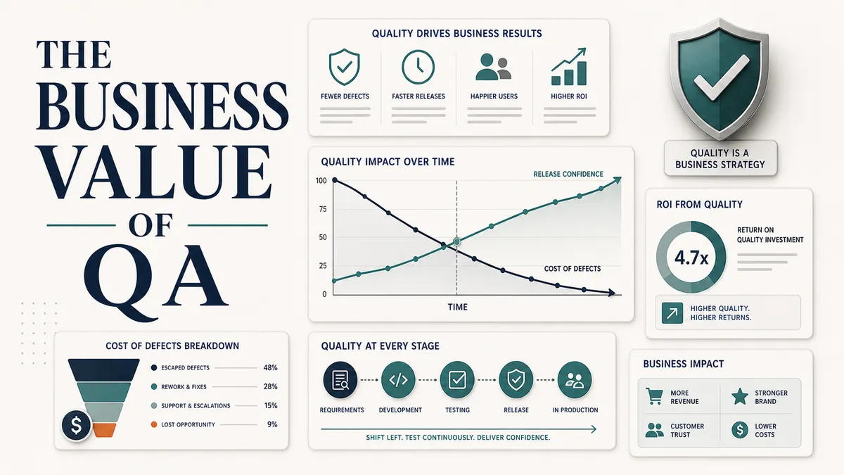
The better QA gets, the less proof it leaves behind. A bug caught while the acceptance criteria are still being written never becomes a ticket. A bad release that never ships never gets a postmortem. The work lands and then it disappears, because a problem that did not happen leaves nothing behind to point at.
So QA tends to look essential only on the day something breaks. A bad release ships, customers complain, support tickets spike, developers drop planned work to chase a production fire, and leadership wants to know how it happened. Right then, in the middle of the mess, the value is obvious. It is also too late, because the damage is already done.
I have spent a lot of my career being the person whose best days produced the least evidence. The prevented bug and the release that never went out are invisible by design, so the real problem is making them legible on purpose. That means pricing the incidents that did not happen and reporting risk instead of activity, in language a product lead or an engineering director understands without translation.
Here is how I think about it, and how I report it.
Stop reporting bug counts as if they were the story
If the only number you bring to a stakeholder is “QA found 32 bugs this sprint,” you have quietly told everyone that QA is a defect counter. Bug counts have their place, but on their own they invite the wrong question. A high count looks like the product is falling apart. A low count looks like QA was not busy. Neither reading is true, and both miss what you actually did.
QA earns its keep when it helps the company do things leadership already has on its list:
- Prevent expensive rework.
- Keep production incidents down.
- Release faster, with confidence instead of crossed fingers.
- Protect the revenue-critical journeys like checkout, signup, and subscription.
- Reduce the support burden that avoidable bugs create.
- Catch accessibility, compliance, and reliability problems before a customer or a regulator does.
- Give product a clearer picture so it can make better calls.
This is the vocabulary that travels. It is also a more honest description of what a good QA practice contributes than any bug tally will ever be.
Start with what poor quality actually costs
The fastest way to make quality legible to a business is to put a number on its absence. Poor quality is never free. It is just billed to a different account, later, with interest.
Quality work is cost avoidance, and cost avoidance is a business activity.
You do not need a headline statistic for this. The number that lands is the one from your own product, because a defect gets dramatically more expensive the later you catch it. A bug found while you are still refining acceptance criteria is a conversation. The same bug found in production is a different animal, because of everything that gets stapled to it:
- the hotfix itself
- a rollback or a forward patch
- data cleanup for whatever the bug corrupted
- a customer message explaining what happened
- the developers you pulled off planned work to deal with it
- the post-incident write-up afterward
The code change is the small part. Everything in that list is the expense.
So translate a real incident into that language. Here is the shape I use. This is a template, not a real incident, so drop in your own numbers from your tracker and your own analytics. The brackets are the parts only your team can fill.
Production bug:
[what broke, in one line a non-engineer understands]

Impact (pull these from your real tracker and analytics):
- [hours] live before detection
- [support tickets] tied to it
- [failed attempts / affected users]
- [developers] pulled from planned sprint work
- emergency patch and re-test required

What would have caught it:
- [the API test that owns this rule]
- [the smoke test that covers this flow]
- [the alert on this error rate]
Here is a real one, anonymised. A change to how the app connected to its environment was about to ship in a way that would have locked real customers out at login. Live, that is a full outage for everyone trying to sign in. We caught it in QA before it went out. I know exactly what the other version of that costs, because the same class of issue did reach production once, and every customer was blocked from logging in until it was rolled back. Caught in QA it was a quiet ticket. Caught in production it was an all-hands incident with a revenue number attached to every minute.
Filled in with your own numbers, that reads as a business case, not a bug report. It connects one defect to money, time, customer trust, and prevention, and it ends with something the team can build instead of something to regret. Do this two or three times with real incidents and people stop seeing QA as the department that finds problems and start seeing the one that prices them.
Tell before-and-after stories, not snapshots
A single metric on a single day rarely lands. Change over time does, because change is what people feel. When you want someone to understand the difference QA made, show them the two states side by side.
| Before | After | |
|---|---|---|
| Regression cycle | four days, manual | smoke suite runs in continuous integration in minutes |
| Release testing | starts late, after code freeze | acceptance criteria reviewed before development starts |
| Test data | shared accounts, fragile | documented setup, repeatable |
| Release decision | hope and a prayer | risk summary shared before deploy |
| Escaped critical bugs | roughly monthly | rare, and converted into coverage |
A table like that tells a story a dashboard cannot. It says the team used to fly blind into a release and now walks in with a map. That narrative is what sticks in the meeting after the meeting.
Pick metrics that point at outcomes
When you do reach for numbers, choose ones that connect to delivery and to customers, not just to test activity. A blend works best, because no single metric survives contact with a clever stakeholder on its own.
| Metric | What it actually tells leadership |
|---|---|
| Escaped defects | what reached real customers |
| Defect severity mix | how serious the risk was, not just how many |
| Regression cycle time | how fast you can safely release |
| Flaky test rate | whether the team trusts its own automation |
| Change fail rate | how often a release causes a problem |
| Failed deployment recovery time | how fast you recover when one does |
| Support tickets after a release | the customer-side cost of what shipped |
| Defect reopen rate | whether fixes are landing cleanly the first time |
| Automation feedback time | how quickly the team learns a change is safe |
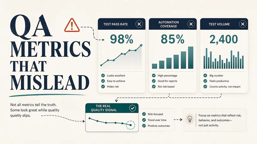
Two of those, change fail rate and failed deployment recovery time, come straight from the DORA research on software delivery, and they matter to QA because they measure what happens after a release lands, not just what passed before it. I teach the five DORA keys in full, including why the names changed and how each one connects to QA, in common QA metrics that mislead teams. Use that as the reference and quote the names back to leadership in the vocabulary they already track.
Here is how the pieces fit together, from a quality signal all the way to something the business pays attention to.
A warning that comes from experience: pick the wrong metrics and you will prove the opposite of what you intended. Counts and pass rates and raw automation percentages are easy to game and easy to misread. A beautiful dashboard can hide bad data while everyone feels safe. Choose signals that get harder to fake the better the work gets, not easier.
Estimate saved time honestly
QA loves to claim that automation saves time, and it does, but the math people present is usually too generous to be believed by anyone holding a budget. Be the person in the room whose numbers hold up.
Start with the obvious part. The numbers below are illustrative placeholders to show the shape of the sum. Replace every bracket with what you actually measured.
Manual smoke test:
- [scenarios] scenarios
- [minutes] each = [scenarios x minutes] per release
- [releases] releases per week = [total] minutes per week

Automated smoke suite:
- [minutes] per run
- [releases] releases per week = [total] minutes per week

Direct execution time saved: [manual total - automated total] per week
Then subtract the costs that automation actually carries, which most reports quietly leave out:
- maintenance and updates when the application changes
- time spent investigating failures, real and false
- test data setup and teardown
- continuous integration compute cost
- the hidden tax of a flaky suite, which is people quietly ignoring it
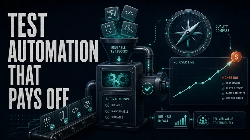
Automation return on investment is not simply manual time minus automated time. If the suite is flaky, that subtraction is a fantasy, because a suite nobody trusts has negative value: it costs time and produces no confidence. A small, reliable suite people actually believe is worth more than a large one they route around. For the longer version of that argument, including how to choose what is even worth automating, I wrote test automation that pays off.
Connect QA to customer trust
Some of QA’s value resists a dollar sign, and that is fine, because leaders care about trust too once you name it concretely. Trust is built through consistency, and consistency is precisely what good QA protects. Make it tangible:
- users complete critical flows without confusion or dead ends
- the app does not crash on the devices your customers actually carry
- error messages help people recover instead of stranding them
- accessibility problems are caught before a customer hits them
- customers do not have to contact support for things that should just work
- the release notes match what the product actually does
None of those line items show up in a bug count. All of them show up in retention, in app store ratings, and in the tone of your support inbox.
Report risk, not activity
This single shift changes how leadership sees QA more than any metric does. Activity reporting describes what QA did. Risk reporting helps someone decide. Compare these two.
Activity:
QA completed 120 test cases.
Risk:
Release quality summary
- Critical paths (checkout, login, subscription) passed.
- No open critical or high-severity defects.
- Known risk: the new referral flow was verified on Chrome and
  Safari, but not Firefox, due to an environment issue.
- Automation: smoke suite green in CI; API subscription tests passed.
- Recommendation: release, with monitoring on referral conversion
  and signup errors for the first 24 hours.
The first sentence tells leadership nothing they can use. The second hands them a decision: what is safe, what is uncertain, and what to watch after the deploy. The second version is the one that gets you invited to the go or no-go conversation, which is where QA’s influence actually lives. If you want a fuller version of that handoff, from a bug through to a green release, I walked through it in a practical QA release workflow (coming soon).
Make prevention visible
Prevention is the most valuable thing QA does and the easiest to overlook, because a problem that never happened generates no ticket and no story. So you have to deliberately surface it. Keep a running list of the work that never turned into an incident:
- caught ambiguous acceptance criteria before a line of code was written
- spotted missing error handling during design review
- flagged a data migration risk before the release that would have triggered it
- recommended one API test in place of five brittle UI tests
- noticed a support trend and added regression coverage to close the gap
These are not soft wins. Each one is a production incident that did not occur, a sprint that did not get derailed, a refund that did not get issued. Track them, count them, and report them next to the bugs you found, because together they show that QA is shaping quality upstream, not just inspecting it downstream. This is the heart of the whole-team approach to quality: quality is built in, not tested in, and QA’s job is as much about prevention as detection.
Use a monthly report people actually read
Pull all of this into one short, repeatable document. Short is the operative word. The goal is insight someone can absorb in two minutes, not a novel nobody opens.
Give it an owner and a cadence or it will not survive a busy month. QA owns it and publishes it once a month, on the same day each cycle. Engineering and product leadership are the readers, and it lands in front of them ahead of the planning meeting, not after, so the risks and prevention wins can shape what gets planned next.
# Monthly Quality Report

## Release health
- Number of releases
- Change fail rate
- Rollbacks or hotfixes

## Customer impact
- Escaped defects by severity
- Support tickets tied to recent releases
- Crash and error trends

## Delivery impact
- Regression cycle time
- Automation feedback time
- Flaky test rate

## Prevention wins
- Risks caught before development
- Requirements clarified upfront
- Production issues turned into regression coverage

## Focus for next month
- Highest-risk area
- Automation improvements
- One process improvement
The first three sections show outcomes. The prevention section shows the invisible work. The last section shows you are thinking ahead, which is what turns a report into a seat at the planning table.
Where to start
QA proves its business value by connecting quality work to the outcomes people already lose sleep over: fewer production incidents, faster and safer releases, less rework, steadier customer trust, and smarter release decisions. The mechanics are not complicated. Price your incidents, tell the before-and-after story, choose metrics that point at outcomes, report risk instead of activity, and make prevention impossible to miss.
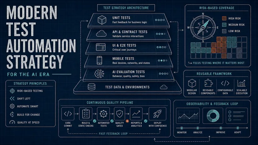
Pick one of these to do this week. The release quality summary is the highest-leverage place to begin, because it changes the conversation in a single meeting and costs you nothing but a few honest sentences. If you want to fold this into a wider plan rather than a one-off report, my test strategy builder walks you through tying coverage and risk to the outcomes a business tracks. Do that, and the next time someone asks what QA is for, you will not have to wait for a bad release to answer. You will already have shown them.
Sources worth keeping open

Written by
Julia Pottinger
Hi, I'm Julia. I've been in QA for over a decade. I spend my days testing software and my own time building apps and games, and I write here to share what I learn, the practical, honest lessons you can actually use.
Comments 0
Share your thoughts, ask questions, or add to the conversation.