
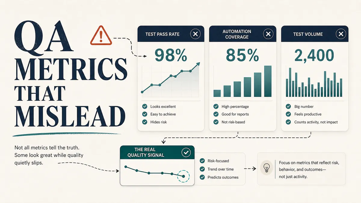
Teams confuse motion with quality all the time. More test cases, more automation, more coverage, and now more AI-generated output, and none of it guarantees anyone understands the risk in the product. The dashboard fills up with green, and green starts to feel like safety.
A thousand passing tests can still miss the one workflow that loses you customers. And a number is at its most dangerous right when it looks best, because that is when a team quietly stops asking what is underneath it. A green dashboard is riskiest the moment everyone has decided to trust it.
The problem is almost never the metric itself. It is the metric used without context. A number on its own cannot tell you whether you tested the right things, whether the work that mattered actually got done, or whether you are about to push a quiet failure into production.
So these are the QA numbers I am most careful with, the ones that fool good teams, and what I would rather look at in their place.
Why good metrics go bad
There is one idea worth keeping in your head whenever someone hands you a target. It is called Goodhart’s Law: when a measure becomes a target, it ceases to be a good measure.
The moment you reward a team for a number, they will move that number. And they will move it in whatever way is easiest, which is rarely the way that helps your users.
Here is how that plays out in practice. A team cannot ship code with critical or high severity bugs, so someone quietly decides the bugs are really “medium” because there is a workaround.
The metric stays green. The bugs stay in. Counts like bug totals and lines of code are often meaningless on their own and easy to game.
None of this means measuring is the problem. Measure, but measure honestly. Every metric below is fine as one input among several, and dangerous the moment it stands alone or becomes the thing a team is graded on.
Number of test cases
Test case count is the classic vanity metric. It sounds substantial in a status meeting. “We have 1,200 test cases” lands like progress.
This is teams confusing more testing with better quality: more test cases, more automation, more coverage, and now more AI-generated output do not automatically mean anyone understands the product risk.
A raw count tells you nothing about whether those tests:
- Cover your highest-risk areas.
- Are still current.
- Are half duplicates.
- Get run by anyone.
- Have ever caught a real problem.
A team with 200 sharp, risk-based tests will usually have stronger coverage than a team carrying 1,200 stale ones, and the smaller suite costs a fraction of the maintenance.
Test count rewards adding tests. It quietly punishes the much harder, more valuable work of deleting the ones that no longer earn their keep.
What I would rather know:
- Coverage of your critical user journeys, not your total test count.
- Coverage of high-risk business rules: payments, permissions, data integrity.
- Tests added or updated after a production incident, so failures teach you something.
- Tests retired because they stopped adding value.
Number of bugs found
Bug count is one of the easiest numbers to misread, because it points in two directions at once.
If QA logs a lot of bugs, is QA doing great work? It might be a healthy safety net. It might also mean the requirements were unclear, the code came in rough, the feature was handed over before it was ready, or the team keeps re-finding the same class of issue instead of fixing the cause.
If QA logs very few bugs, is quality high? Maybe. It might also mean the testing was shallow, the test data was thin, the risky paths were never exercised, or QA ran out of time and your users are about to find what you missed.
The number alone cannot tell you which story is true. What I would rather know:
- Escaped defects by severity: what reached production and how badly it hurt.
- Defects found before release versus after, as a trend over time.
- Root-cause categories, so you can see the patterns repeating.
- Where the bugs cluster by feature area, which tells you where the risk actually lives.
Pass rate
A 98 percent pass rate sounds like good news, and that is exactly why it is risky. The number flattens every test into one of two buckets and treats them as equal. They are not.
One failing test on checkout, login, billing, or account access matters more than two hundred passing tests on a settings page nobody touches.
So when I see a high pass rate, I ask what is behind it:
- Are the failing tests the important ones?
- Are the passing tests covering real risk, or just the happy path?
- Were any tests skipped, quarantined, or flaky?
- Is the suite even current?
A high pass rate on a suite that only checks the easy paths tells you the easy paths work. Nothing more.
A release summary that actually helps the people deciding whether to ship looks more like this:
Smoke suite: passed.
Subscription API tests: passed.
Open: one non-blocking visual issue on tablet, no functional impact.
Known gap: referral analytics not verified, dashboard environment was down.
Recommendation: release with monitoring on signup and referral events.
That paragraph tells a release manager what passed, what did not, and what to watch. “98 percent pass” tells them almost nothing.
Zero open bugs
“Zero open bugs” can sound like the picture of quality. It can also mean the team closed, deferred, downgraded, or simply never found the issues. An empty bug list is only good news if you trust the testing behind it.
The better question is not “how many open bugs do we have?” It is “do we understand the risk we are shipping with?”
A release with three known low-severity bugs that you have written down and accepted is almost always safer than a release with an empty list and shallow testing, because the first team knows what it is shipping and the second is hoping.
Honest release notes name the open issues and the residual risk on purpose:
Open issues:
- Low: tooltip alignment on account settings.
- Medium: export progress message is unclear for files over 500MB.

Residual risk:
- No known data loss, payment, login, or permission issues.
- Export issue affects clarity, not file generation.

Recommendation:
- Release with a support note and a follow-up UX fix next sprint.
The same trap in the other numbers
Once you start looking for it, the same shape turns up everywhere QA gets counted. Each of these is a fine input and a bad headline. What fools teams, and what I would rather watch:
- Automation percentage. “We automated 80 percent of regression” is wonderful if those tests are stable, relevant, and fast, and a liability if they are flaky and slow, because now you have automated your way into a suite people no longer trust. Watch feedback time and flaky rate, not the percentage. Chasing the number for its own sake is how teams end up with automation that does not pay off.
- Test execution progress. “75 percent of test cases executed” sounds three-quarters ready. It is not, if the last quarter is where your highest-risk flows are sitting. Ask whether the critical path is done and what is blocked, not what percent is finished.
- Defect density. Bugs per thousand lines of code can spot a worrying trend inside one component over time. Rank teams by it and you reward whoever drew the easy work and punish whoever took on the hard, high-stakes problem, which is exactly the work you want your strongest people doing. Weight defects by risk instead.
- Mean time to test. Long QA time is usually a symptom, not the disease: incomplete stories, unstable environments, missing test data, late changes. Squeeze the tester and you get faster, shallower testing and the same upstream mess. Measure the waiting instead, because that is where the time actually goes.
Vanity metric versus the honest signal
Here is the pattern across all of them. The popular number answers an easy question. The useful signal answers the question you actually care about.
| Question you really have | Vanity metric | Honest signal | Who acts, and how |
|---|---|---|---|
| Do we cover what matters? | test case count | critical-journey coverage | QA maps coverage to the top revenue journeys and fills the gaps |
| Is the product actually good? | bugs found | escaped defects by severity | QA lead trends escapes by severity and feeds the worst back into refinement |
| Is this release safe? | pass rate | risk-weighted pass + known gaps | QA writes the risk summary; the team makes the go or no-go call |
| Is our automation paying off? | automation % | feedback time + flaky rate | EM watches feedback time and flaky rate; QA quarantines and rewrites flakes |
| Are we done testing? | % executed | critical path + blockers | QA reports whether the critical path is clear, and names what is blocked |
| Where is the risk? | defect density | defects by risk + root cause | QA and dev cluster defects by root cause and fix the top one |
The left column is easy to count, easy to chart, and easy to game. The right column takes more thought and tells you something true, and the last column is what a lead does about it on Monday. When you have to choose, choose true.
A metric set with some honesty in it
The fix is a balanced set of numbers, with enough tension between the measures that no single one can be gamed without another one catching it.
This is the core argument of the SPACE framework, which warns directly against reducing productivity to a single dimension and recommends pulling metrics from at least three dimensions at once. The same thinking holds for quality.
Here is the spread I would keep in front of a team:
| Area | A signal worth tracking |
|---|---|
| Product quality | Escaped defects by severity, support and crash trends |
| Delivery | Lead time for changes, change failure rate, deploy frequency |
| Automation | Flaky test rate, feedback time, critical-flow coverage |
| Process | Reopen rate, blocked-testing time, unclear-requirement trends |
| Customer | Crash-free sessions, funnel errors, satisfaction trends |
The delivery row is where the DORA metrics come in, and they are a strong starting point precisely because they hold speed and stability in tension.
Worth knowing: DORA quietly grew from four keys to five, split across two sides that pull against each other on purpose:
- Throughput: change lead time, deployment frequency, and failed-deployment recovery time.
- Stability: change fail rate and, elevated to DORA’s fifth key metric in 2024, deployment rework rate.
DORA is explicit that you should never let one metric rule them all, and its research keeps finding that speed and stability are not a tradeoff. The best teams are good at both at once.
That tension matters more than ever right now. The 2025 DORA report found that AI-assisted development is finally lifting throughput, teams are shipping more, but it still drags on stability unless a team has strong automated testing and fast feedback underneath it.
AI makes a fast pipeline faster and a fragile one more fragile, which is exactly why QA has to act as the control layer for AI-assisted development.
For metrics specifically, it means this: if you are leaning on AI to move quicker, your honest stability signals are the guardrail, and a green pass rate will hide the cliff edge right up until you go over it. The faster you ship, the more your metrics need to be telling you the truth.
Give every metric a story
A number with no context is a number someone will misread. So before a metric goes on a dashboard or into a release note, I want it to answer five plain questions:
- What changed.
- Why it changed.
- Whether that is good or bad.
- What decision it points to.
- What we do next.
Here is what that looks like for a flaky-test spike:
Flaky test rate rose from 3% to 11% this month.

Why:
- Most failures are checkout UI tests, after the new loading state shipped.
- These are test problems, not product defects, but they are blocking releases.

Decision and action:
- Move promo-code validation checks down to the API level.
- Update UI waits to key off the payment-completion state, not a timer.
- Quarantine the two worst tests until they are rewritten.
That is a metric doing its job. It points at a cause and ends in an action, instead of just glowing red on a screen.
Measure what helps you decide
QA metrics exist to help a team think better. So the test I apply to any metric is simple: does it create insight, or just pressure?
If a measure rewards test count over coverage, pass rate over genuine confidence, or raw speed over learning, it is doing more harm than good no matter how green it looks.
The best quality metrics tell a story. They show you where the risk lives, where the process is getting better, and where the team needs to look next. Pick a small set you trust, give every number the context that makes it honest, and treat anything that becomes a target with healthy suspicion.
A green number with nothing real behind it costs you the most at the exact moment you trust it. Get that right and your dashboard stops being a comfort blanket and starts being something you can actually steer by.
If you want to take this further, it pairs naturally with building a quality strategy that holds up under pressure, and the strategy builder walks you through putting one together.

Written by
Julia Pottinger
Hi, I'm Julia. I've been in QA for over a decade. I spend my days testing software and my own time building apps and games, and I write here to share what I learn, the practical, honest lessons you can actually use.

Comments 0
Share your thoughts, ask questions, or add to the conversation.